
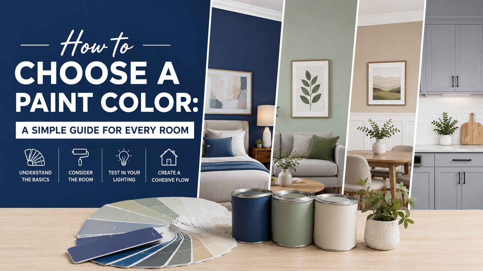
The easiest way to choose a paint color is to start with your room, not the paint store. Look at the natural light, flooring, furniture, cabinets, countertops, and other finishes that are already in the space. Then choose a few colors that work with those elements instead of trying to build the entire room around a paint swatch.
Paint color can change how a room feels, but there is no single “best” color for every home. A shade that looks soft and warm in one room can look cooler or brighter somewhere else because lighting, surrounding colors, and room size all affect how paint appears.
If you are updating several parts of your home, think about the whole space before making your final choice. For example, if you are also working on a bathroom, you may want to consider your color choice alongside your bathroom remodel ideas, rather than selecting a wall color separately.
6 Steps to Choose the Right Paint Color
| Step | What to Consider | What to Do |
|---|---|---|
| 1 | Natural Light | Check how sunlight and artificial lighting affect the color throughout the day. |
| 2 | Paint Undertones | Identify whether the color has warm, cool, or neutral undertones. |
| 3 | Furniture & Finishes | Compare the paint with flooring, furniture, cabinets, countertops, and other fixed elements. |
| 4 | Room Size & Mood | Choose a shade that suits the room’s size and the feeling you want to create. |
| 5 | Adjacent Rooms | Make sure the color works well with nearby rooms, especially in open floor plans. |
| 6 | Paint Samples | Test large samples in the actual room before buying paint or committing to a color. |
1. Consider the Room’s Natural Light
Natural light is one of the biggest factors that can change how a paint color looks on your walls. A color that looks perfect on a small sample may look completely different once it covers an entire wall.
Rooms with plenty of sunlight can usually handle a wider range of colors. Very bright spaces may make pale colors look almost washed out, while stronger colors can appear more vibrant.
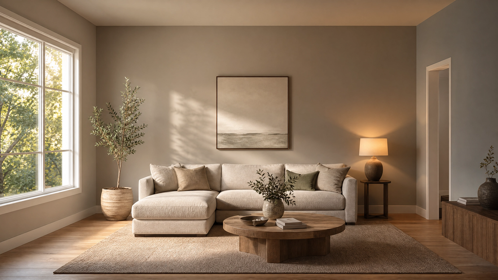
Dark rooms need a little more care. A very cool gray, blue, or green can sometimes make a low-light room feel colder. Warm whites, creamy neutrals, soft beiges, and some warm greens can help create a more comfortable feeling, although the best choice still depends on the room’s existing finishes.
Artificial lighting matters too. Warm bulbs can make paint look more yellow or beige, while cooler bulbs can make some colors appear bluer or grayer.
Check the Room at Different Times of Day
Never judge a paint color from one quick look in the afternoon. Check your samples in the morning, afternoon, evening, and under your normal room lighting.
If possible, place a large sample on more than one wall. A color facing a window may look different from the same color on a wall across the room.
This simple step can prevent one of the most common paint mistakes: choosing a color that looks great in the store but feels completely different at home.
2. Understand Paint Undertones
Undertones are the subtle colors hiding underneath the main color, and they can make or break a paint combination. Two whites may look almost identical on a paint card but appear noticeably different when placed beside your flooring or cabinets.
Common undertones include yellow, pink, red, blue, green, and violet. These undertones are especially important when choosing whites, grays, beiges, and greiges.
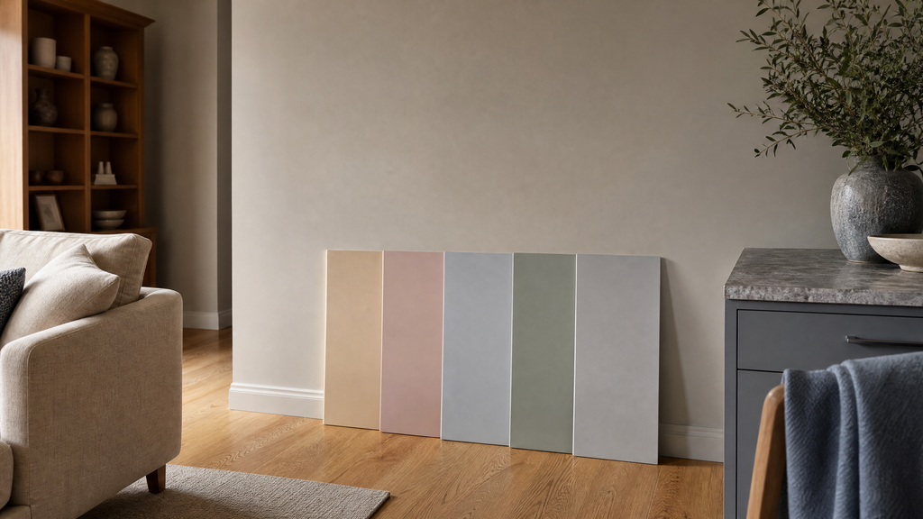
For example, a gray with a blue undertone may feel cool and crisp, while a gray with a beige or brown undertone may feel warmer. A white with a yellow undertone can look creamy, while a cooler white may look cleaner and brighter.
Compare Paint With Your Existing Finishes
The fastest way to spot an undertone is to compare the paint sample directly with the things that will stay in the room. Place samples near your flooring, countertop, sofa, cabinets, curtains, or large pieces of furniture.
Do not judge a color against a completely empty wall if the room will be filled with warm wood, cool stone, colorful furniture, or patterned fabrics.
If you are planning several home improvements, keeping existing materials in mind is important. For example, flooring can have a major visual effect on wall color, which is also why understanding the differences in materials discussed in our LVP vs. laminate flooring guide can be useful when planning a larger renovation.
3. Look at Your Existing Furniture and Finishes
Your paint color should usually support the things you already love rather than fight against them. Before buying paint, make a list of the major colors already present in the room.
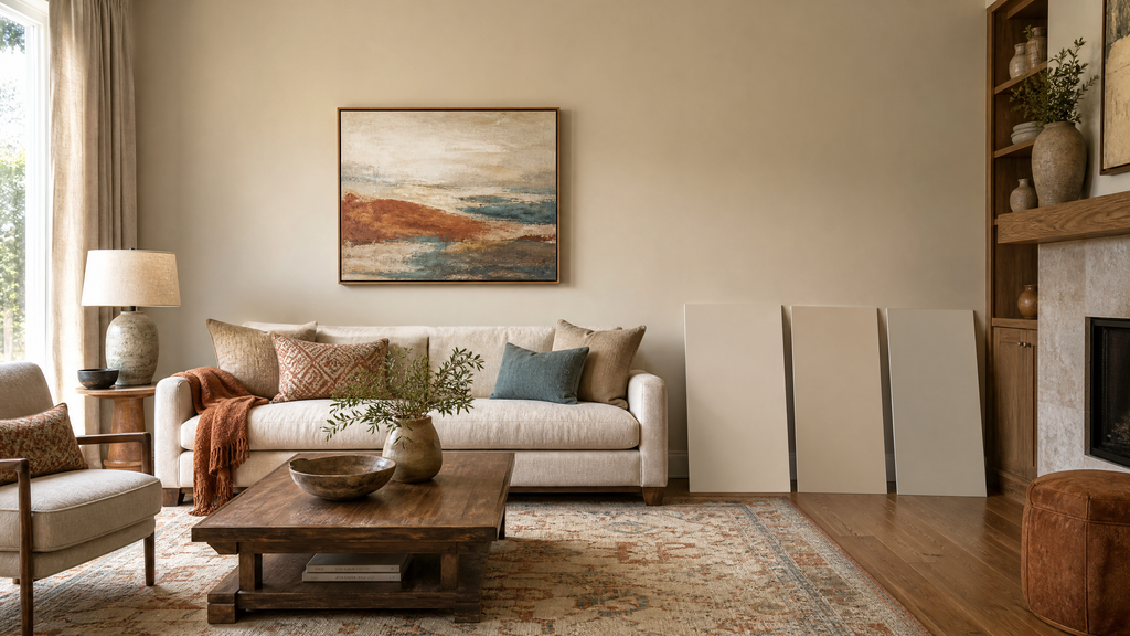
Look at:
- Flooring
- Furniture
- Cabinets
- Countertops
- Rugs
- Curtains
- Upholstery
- Metal finishes
- Tile
- Stone or brick
- Artwork
If your floor has strong warm orange or red tones, a very cool wall color may create a difficult combination. If your room contains cool gray furniture, a warm neutral may create a softer contrast.
Start With Something You Already Love
A favorite rug, artwork, fabric, or piece of furniture can become the starting point for your entire color palette. Instead of choosing a random wall color first, identify two or three colors you already enjoy in the room.
This idea also appeared repeatedly in the Reddit discussion we reviewed, where several people suggested building a palette from artwork, rugs, wallpaper, fabrics, flooring, or other fixed elements.
You do not have to use every color from your inspiration piece. Pick one main color, one supporting color, and perhaps a smaller accent color.
This approach is often easier than starting with hundreds of paint chips.
4. Think About Room Size and Mood
The right paint color should match both the size of the room and the feeling you want to create. Color affects how open, cozy, calm, bright, or dramatic a space feels.
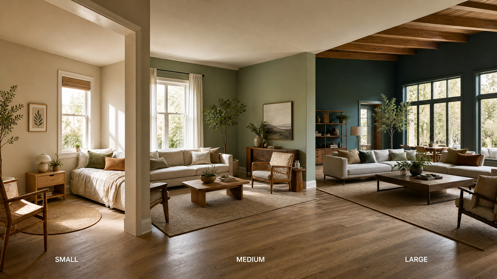
Small Rooms
Light and softly muted colors can help a small room feel more open. Whites, light neutrals, pale greens, soft blues, and gentle warm shades can work well when they also suit the room’s lighting.
That does not mean small rooms must always be white. A deeper color can create a cozy and intentional look, especially in bedrooms, reading spaces, powder rooms, or other areas where you want more character.
Large Rooms
Larger rooms give you more freedom to use stronger colors without making the entire space feel crowded. You can use deeper greens, blues, earthy colors, or richer neutrals when they work with the furniture and lighting.
If the room is very large and open, consider whether you want one consistent color or a connected palette of colors.
Choose the Mood Before the Color
Think about how you want to feel in the room before choosing the exact shade.
For example:
- Bedrooms often benefit from calm, restful colors.
- Living rooms can work with warm neutrals, greens, blues, or earthy shades.
- Kitchens can support clean neutrals or carefully chosen stronger colors.
- Bathrooms can feel fresh with light colors or dramatic with deeper shades.
- Home offices may benefit from colors that feel focused without being distracting.
Your personal preference matters too. A color does not have to follow a trend to be a good choice.
5. Choose a Color That Works With Adjacent Rooms
Paint colors do not need to be identical throughout your home, but rooms that can be seen together should usually feel connected. This becomes especially important in open floor plans.
If your kitchen, dining room, and living room flow into one another without clear doors or walls, completely unrelated colors can make the space feel visually disconnected.
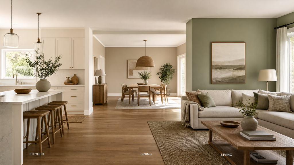
One option is to use the same main wall color throughout the open area and bring in additional color through furniture, rugs, artwork, curtains, and accessories.
Another option is to use different shades that share a similar undertone.
Do You Need the Same Color Throughout the Home?
No, your entire home does not need to use one paint color. Rooms separated by doors, trim, hallways, or clear architectural breaks can have their own personalities.
The Reddit discussion we reviewed had a similar debate, with people sharing different approaches ranging from one color in open areas to using a different color in almost every room. A common theme was that cohesion can come from shared trim, flooring, furnishings, or a related color palette rather than using the exact same wall color everywhere.
There is also no universal rule that says you can only use three paint colors in a home. If you enjoy color, you can use more. The important thing is that the colors work together and make the home feel intentional.
6. Test Paint Colors Before You Commit
Testing a paint color at home is one of the best ways to avoid an expensive painting mistake. Do not rely only on a small store card, an online image, or a digital room preview.
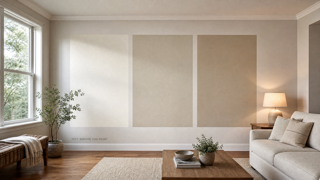
Paint a large sample area or use a large removable sample and observe it in the actual room.
Check it:
- Next to windows
- Near flooring
- Beside furniture
- Against cabinets
- Near trim
- Under artificial lighting
- At different times of day
A color can look completely different when surrounded by your actual room finishes.
Test More Than One Color
Compare two or three closely related shades instead of testing a dozen unrelated colors. Too many choices can make the decision harder rather than easier.
If you are deciding between several similar neutrals, look at their undertones and compare them directly with your flooring and furniture.
Give yourself enough time to live with the samples. A color that looks exciting for five minutes may not be the color you want to see every day.
Best Paint Color Ideas for Every Room
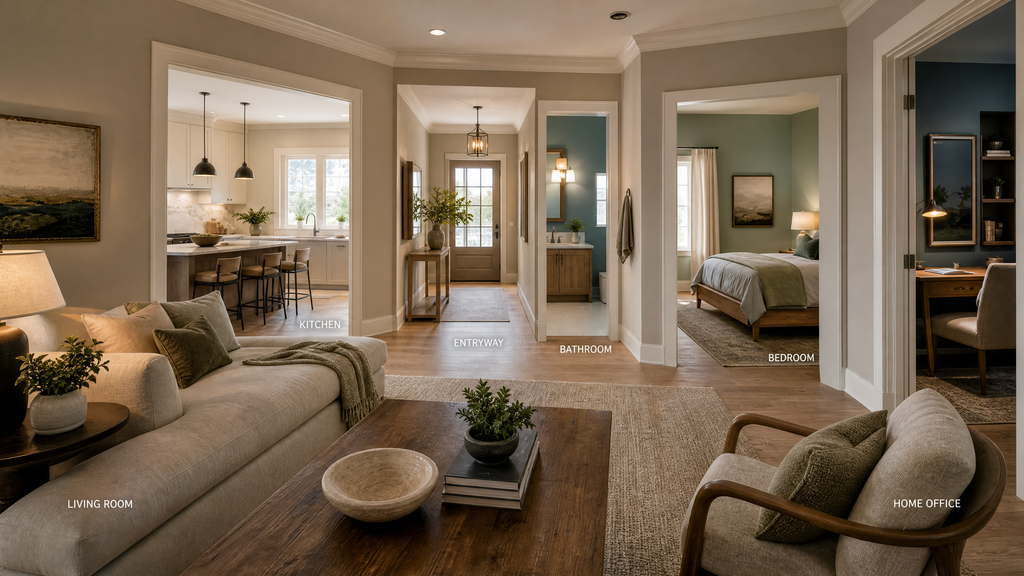
Living Room
Living rooms usually work best with colors that complement your largest furniture and create the mood you want for relaxing and entertaining. Warm whites, beige, greige, muted greens, soft blues, and earthy neutrals can all work when their undertones fit the room.
If your living room has bold furniture or artwork, a quieter wall color can provide balance. If most of the room is neutral, a stronger wall color can add personality.
Bedroom
Bedrooms are ideal for colors that feel calm and comfortable rather than overly stimulating. Soft blue, muted green, warm beige, creamy white, dusty rose, and gentle gray can create a restful atmosphere.
Consider how the color works with your bedding and curtains because these large surfaces can change how the wall color is perceived.
Kitchen
Kitchen paint should work with the cabinets, countertops, backsplash, flooring, and appliances already in the room. Warm whites and light neutrals can create a clean look, while muted greens and blues can add more personality.
If your cabinets and countertops already have strong patterns or colors, a simpler wall shade may provide better balance.
Bathroom
Bathrooms give you an opportunity to use color without committing to a large wall area throughout the home. Soft neutrals can create a clean appearance, while blue, green, or deeper colors can make a small bathroom feel more intentional.
Always consider tile, vanity finishes, flooring, and the amount of natural light before choosing the final shade.
Home Office
A home office should use a color that supports the way you want to work in the space. Soft greens, muted blues, warm neutrals, and other balanced shades can create a comfortable background without becoming distracting.
If you frequently appear on video calls, also consider how the wall color looks behind you under your normal lighting.
Hallway and Entryway
Hallways and entryways can connect the colors used throughout the rest of the home. A neutral hallway can provide a smooth transition between rooms, while a stronger color can make a narrow entry feel more distinctive.
If your entryway is small, look at our small entryway ideas for ways to combine color with practical design choices.
What Reddit Users Say About Choosing a Paint Color
One useful lesson from the Reddit discussion is that there is no single paint-color rule that works for every home. The original discussion focused on choosing a whole-home palette, avoiding too much gray and beige, and deciding whether connected rooms should use the same color.
Several commenters recommended starting with things that are difficult or expensive to change, such as flooring, cabinets, countertops, rugs, and furniture, and then choosing paint that works with those elements. Others suggested using a favorite artwork, rug, wallpaper, or fabric as the inspiration for a palette.
Another strong piece of practical advice was to test larger samples and move them around the room, because lighting can change how a color appears.
My takeaway is simple: use decorating “rules” as guidance, not as strict requirements. If an open-plan space benefits from one color, use one. If separate rooms feel better with different colors, that can work too. A successful palette should feel connected, but it should also feel like your home.
The discussion also reinforces an important point for anyone choosing paint: do not design around a trend alone. Choose colors that work with the permanent parts of your room and that you genuinely enjoy seeing every day.
You can read the discussion on choosing an interior color palette to see the different approaches people shared.
Common Paint Color Mistakes to Avoid
Most paint color mistakes happen because people judge the color before considering the entire room.
Choosing From a Tiny Swatch
A small paint card cannot show you exactly how a color will look across a large wall. Always test a larger sample before making the final decision.
Ignoring Undertones
A color can look wrong simply because its undertone clashes with another finish in the room. Compare your sample with flooring, cabinets, countertops, and furniture before deciding.
Forgetting Lighting
A color that looks beautiful in natural daylight may look very different at night. Check it under the lighting you actually use.
Matching Everything Too Closely
Your walls do not need to match every item in the room. A little contrast can make a space more interesting and prevent it from feeling flat.
Following Trends Too Closely
Trendy colors can be useful for inspiration, but your home does not need to follow every current color trend. Choose a shade that suits your space, taste, and existing finishes.
Skipping the Sample Test
Buying several gallons before testing the color is one of the easiest ways to waste money on paint. A small sample is much cheaper than repainting an entire room.
If your project also involves wall repairs, make sure those are addressed before painting. For example, our guides on drywall nail pops and wall cracks can help you identify common wall problems before applying a fresh coat of paint.
How to Narrow Down Your Final Paint Color
The best way to make the final choice is to reduce your options step by step.
Start by deciding which room you are painting and what mood you want. Then identify the colors and undertones already present in the space.
Next, choose a small group of paint samples that fit those existing elements. Eliminate any colors that clearly clash with your flooring, furniture, cabinets, or lighting.
After that, test the remaining colors on large samples and observe them throughout the day.
Finally, choose the color that looks good in your actual room, works with your existing finishes, and feels right to you. You do not need to find the “perfect” color on the first try. You need a color that works well in the space you actually live in.
If you are completing several home projects at the same time, keep your overall home style in mind. For example, practical updates such as organizing bathroom cabinets or improving other functional areas can also influence how you want your finished rooms to feel.
Final Thoughts on Choosing a Paint Color
Choosing a paint color becomes much easier when you stop treating the paint chip as the starting point. Begin with the room’s light, fixed finishes, furniture, size, and the mood you want to create.
Then pay attention to undertones, consider how nearby rooms connect, and test your final choices in the actual space before buying enough paint for the project.
Most importantly, do not let decorating rules make the decision harder than it needs to be. Your home should feel cohesive, comfortable, and personal—not simply like a copy of a current trend.
A thoughtful paint choice can refresh a room without requiring a complete renovation. Take your time, test your options, and choose the color that works best with the home you already have.
Frequently Asked Questions
Find quick answers to common questions about choosing the right paint color for your home.
| 1 |
What is the 3 color rule in interior design?The 3 color rule is a simple way to keep a room’s color palette balanced. You can use one main color, a second supporting color, and a smaller accent color. For example, walls can provide the main color, furniture the second, and pillows or artwork the accent. It is a guideline, not a strict rule. |
| 2 |
What color makes a house look expensive?Warm whites, soft beige, taupe, earthy greens, and rich neutral shades can give a home a more polished look. The color itself is only part of the result. Clean finishes, good lighting, natural materials, and thoughtful contrast often make a bigger difference than choosing a particular “luxury” color. |
| 3 |
What is the most popular paint color right now?Warm whites, soft neutrals, earthy greens, and other nature-inspired shades are popular choices in 2026. However, the most popular color is not necessarily the best color for your room. Always consider your lighting, flooring, furniture, and existing finishes before following a trend. |
| 4 |
Should paint color match the furniture?Paint does not need to match your furniture exactly; it should complement it. Look for shared or compatible undertones and choose a wall color that supports your larger furniture pieces instead of competing with them. |
| 5 |
Should all rooms in a house be the same color?No, different rooms can have different paint colors while still feeling connected. Using related shades, similar undertones, or a consistent trim color can help create a smooth flow between spaces. |
| 6 |
Is it better to choose paint or furniture first?It is usually easier to consider your furniture and permanent finishes before choosing the paint. Flooring, cabinets, countertops, and large furniture pieces are harder to replace, while paint gives you many more color options to work around them. |
Sources & References
Reliable sources can help readers verify important safety information before starting a painting project.
- U.S. Environmental Protection Agency (EPA) — Renovation, Repair and Painting Program — Guidance for homeowners about lead-safe painting and renovation practices.
- EPA — Lead-Safe Renovations for DIYers — Practical guidance for safely handling painting and renovation work in older homes.
- HUD — Lead-Based Paint Guidelines — Information about evaluating and controlling lead-based paint hazards in housing.
1 thought on “How to Choose a Paint Color: A Simple Guide for Every Room (2026)”